
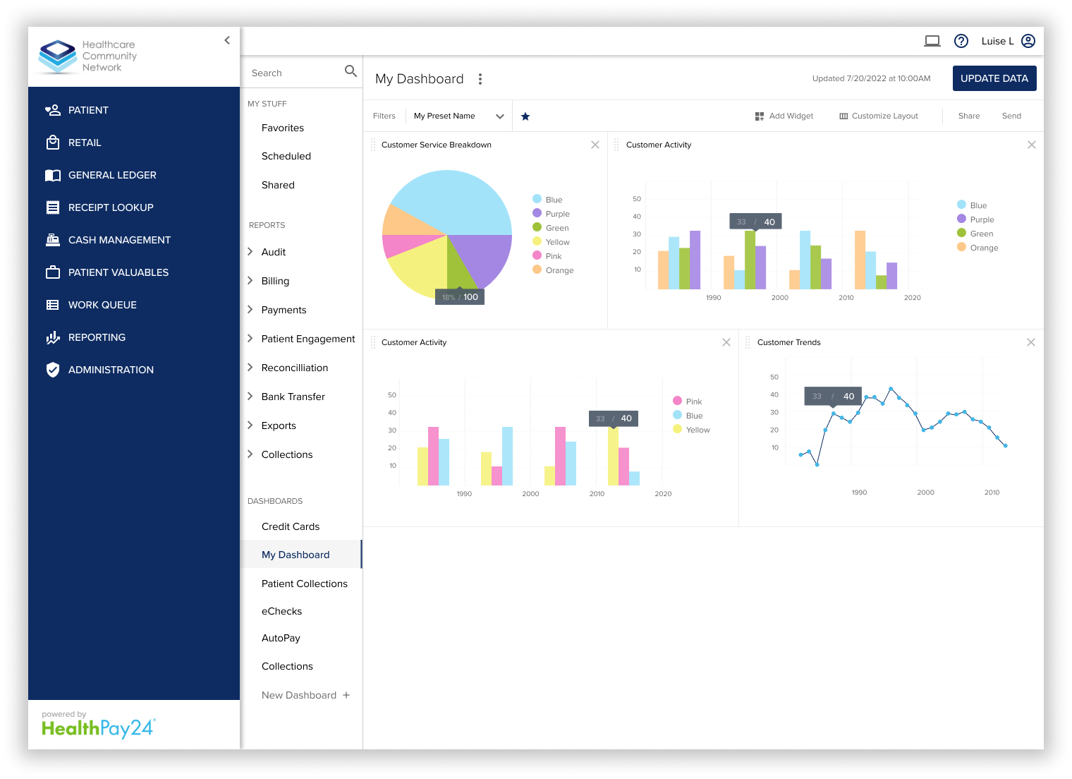
This dashboard design is used in HealthPay24's reporting module. Each graph can be configured and rearranged on the dashboard.
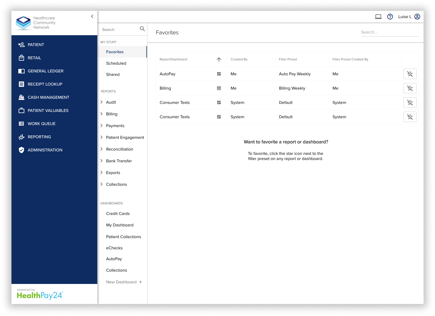
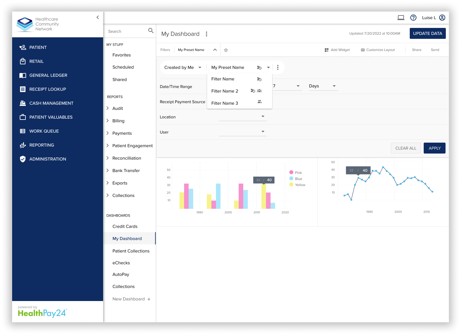
A big part of this design was the need to support multiple filter presets, and be able to share those presets with other users. This dropdown shows presets "created by me" but the user could find presets created by other users in the health system.
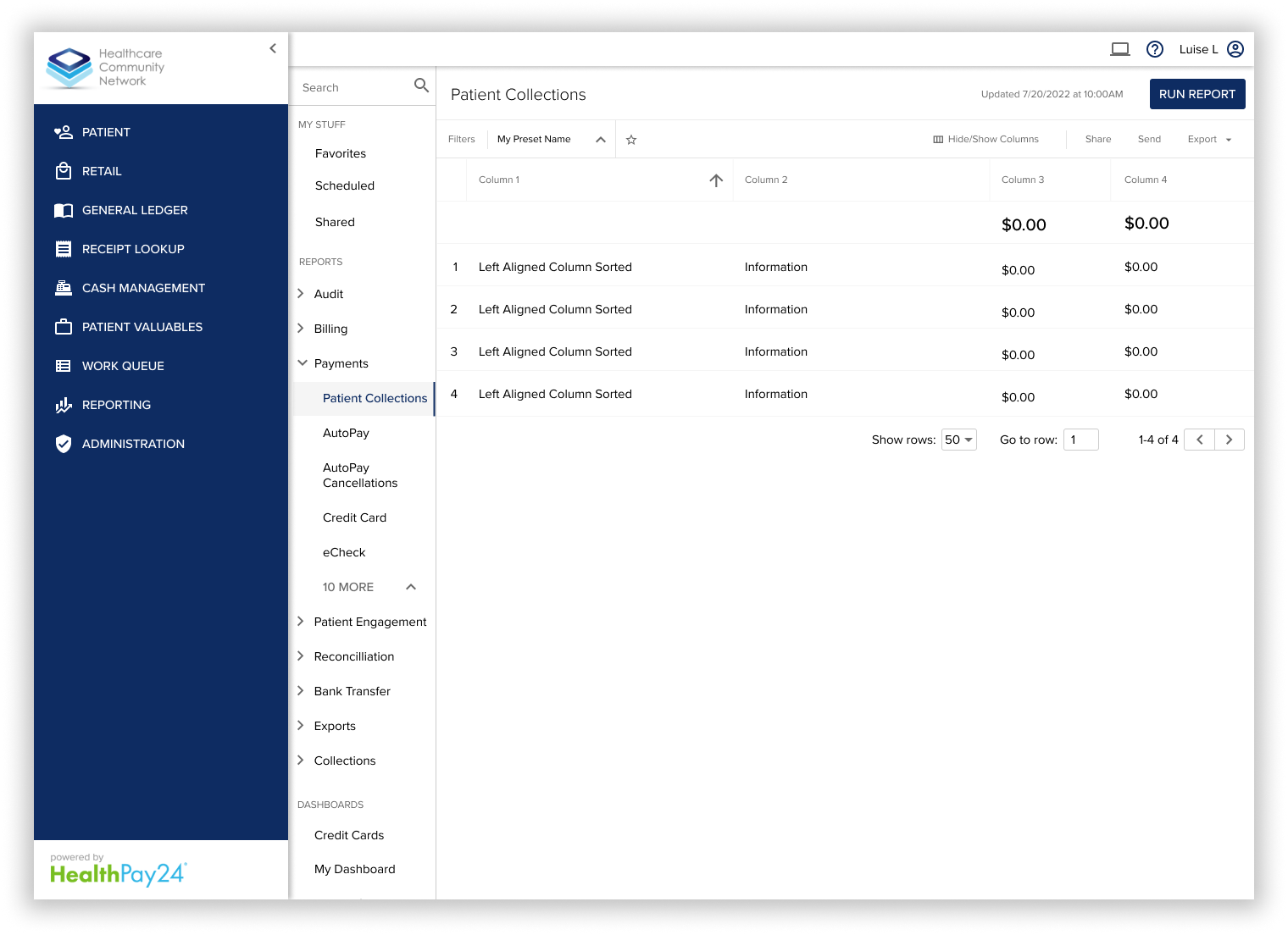
The reporting module in HealthPay24 also needed to support showing data in a table format.
This "favorites" screen shows the user's saved filter and report presets.